Buttons
Buttons are used to provide a clear call to action. Their role is to provide immediate affordance for the next steps a user should take on a screen—whether it's to download a file, sign up for a demo, or save progress on a screen.
For complete examples of our buttons in action along with schema and API information, see the button component and button group component documentation in Pattern Lab.
Best Practices
A button's job is to give someone a clear next step to engage in. Here are some key things to keep in mind when using them in your work:
Use clear and action-oriented labels
The label for a button should be concise, clear and action-oriented, e.g. "Save," "Sign Up," etc. Avoid unclear labels like "White Paper" or "Go."
Stick to the color themes
In Bolt, buttons change in appearance based on the theme they're contained within. These themes were designed intentionally to maximize affordance, legibility and clarity.
Avoid overusing buttons
The best use for a button is at the end of a form, or in a prominent area of the page such as a hero band. Avoid using too many buttons; if you need to include two calls to action in a single band, use a button group instead. If you have multiple calls to action on a page (e.g. a bunch of cards), default to a text style button instead.
Examples
Below are some examples of common use cases for buttons.
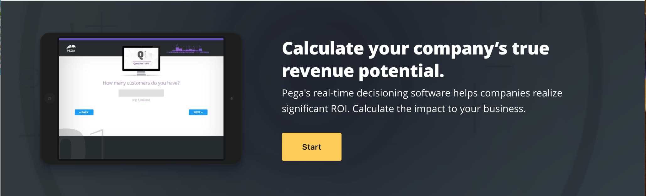
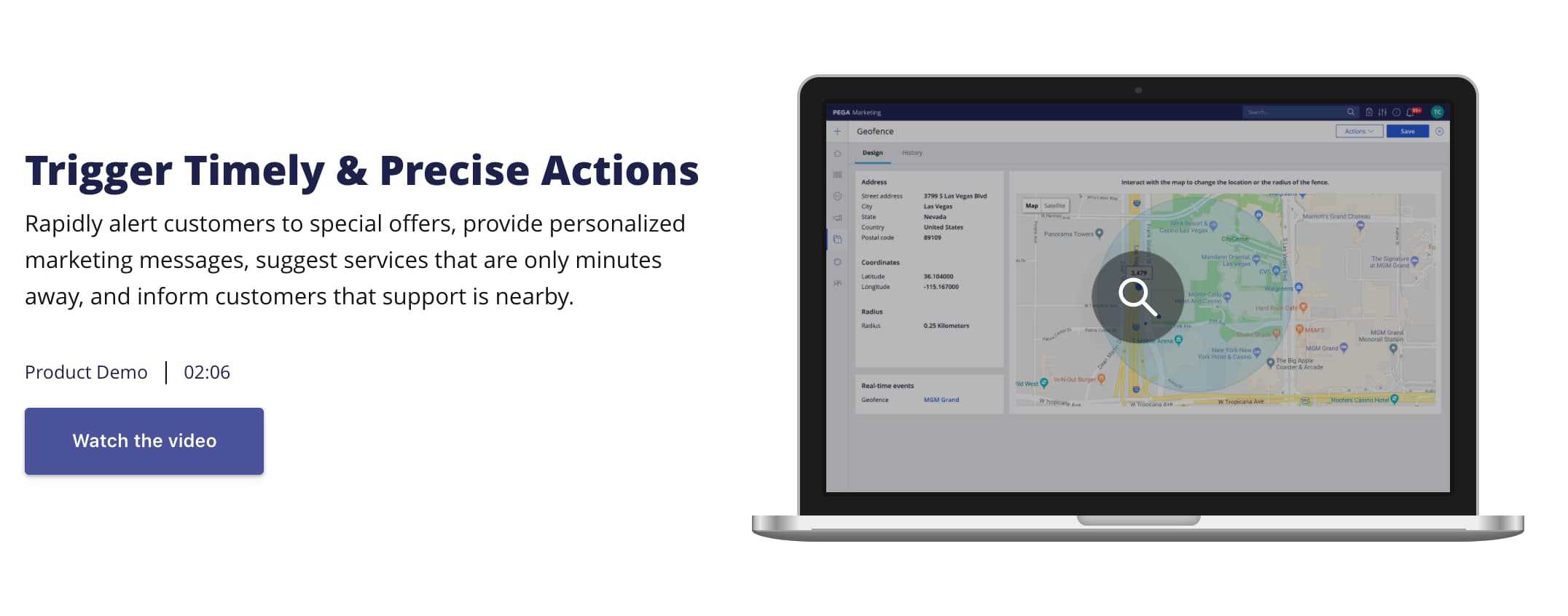
Buttons in bands
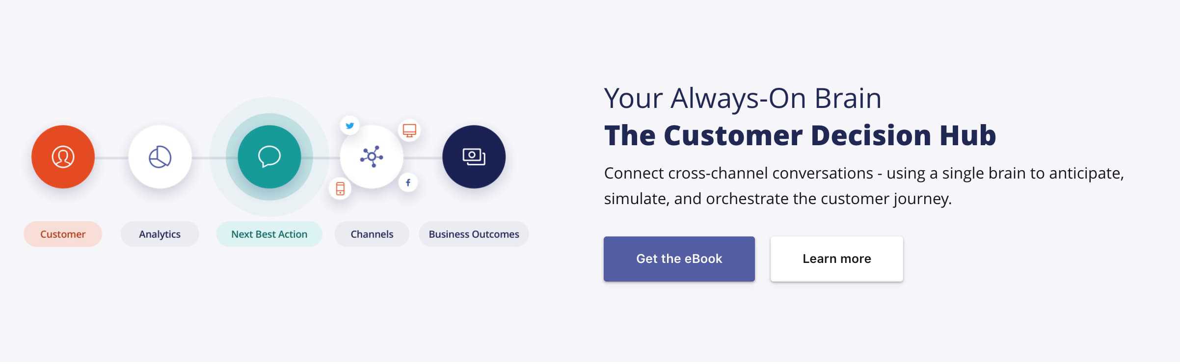
When placed in a themed container (such as a band or a card), buttons are styled based on the container's theme, along with the type of button getting used (primary, secondary, text, etc).
When two buttons exist in the same band, the second button should be styled as a secondary button. In bands, you can use a button group to create the styling by default.
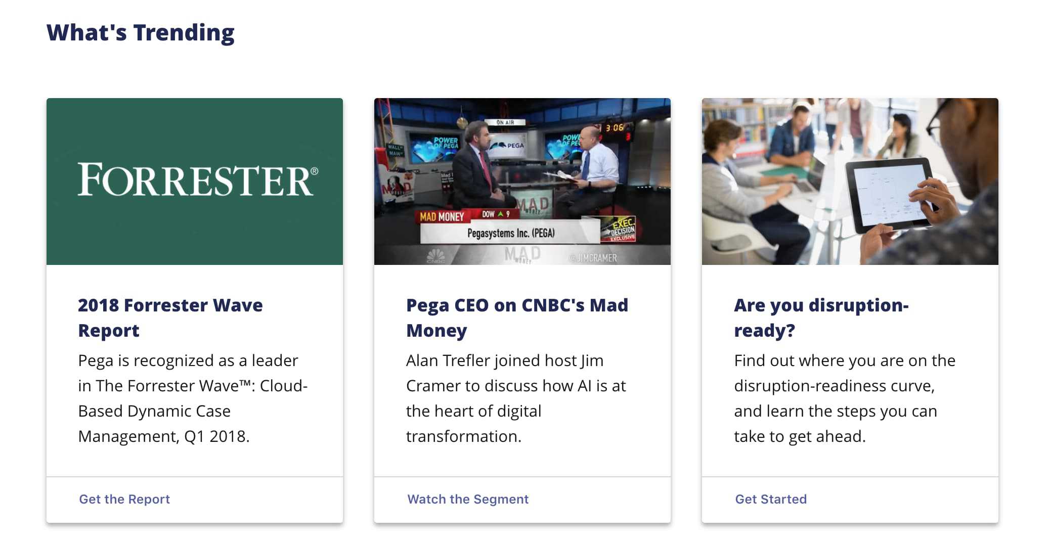
When creating a layout that includes a number of calls to action, such as a trio of cards, use the text style button instead of primary or secondary button styles to minimize cognitive overload.